


→ Illustration, function and identity
Reedsy, where beautiful books are made
Reedsy, where beautiful books are made
Since December 2020 I have been part of Reedsy's team, with the aim of providing visual resources and illustrations for editorial articles and internal products, as well as helping to strengthen the company's visual identity.
Since December 2020 I have been part of Reedsy's team, with the aim of providing visual resources and illustrations for editorial articles and internal products, as well as helping to strengthen the company's visual identity.
General approach
The tone of Reedsy's illustrations is simple, bright, and cheerful. Even the most dramatic ones are only so to a point and, ultimately, a lighthearted vision prevails. They are, mostly, illustrations for writers. Creative people who like to read and tell stories. Exploratory metaphors of their own writing journeys, featuring adventure and discovery, are frequent. There is also a universalist intention in them, breaking down physical, cultural or even temporal borders.

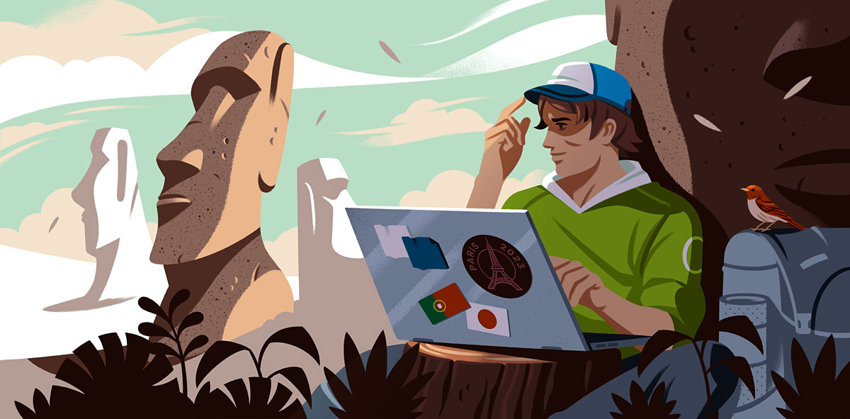
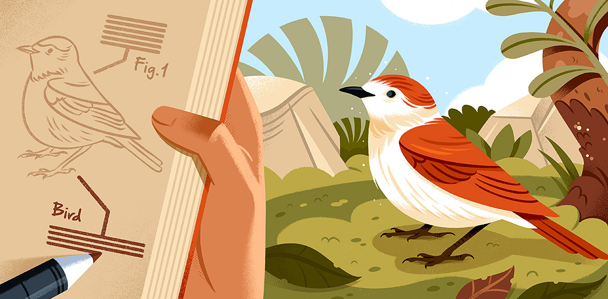
Playfulness, adventure and beauty


Dramatism... but not too much ^_^
Many of the illustrations contain short stories of their own, which sometimes unfold across multiple articles in guides, allowing us to thematically unify different series of articles and illustrations. Various people are implicated in the conceptualization of these images in a transversal way: from the art director to the content and conversion teams, all along through the company's management. A real team effort.



Examples of thematically associated illustrations
Simplicity & readability (but with character)
Most of Reedsy's illustrations are found in article headers or in-post images. A good percentage of the public will find them on mobile devices, be it on social media, Google or Reedsy's own blog.
This implies that they will be viewed at very small sizes, so illustrations saturated with details will go unnoticed or, in the worst case, generate confusing images. It should be easy for the user to read them, scan the main elements, and get the topic/theme in seconds.
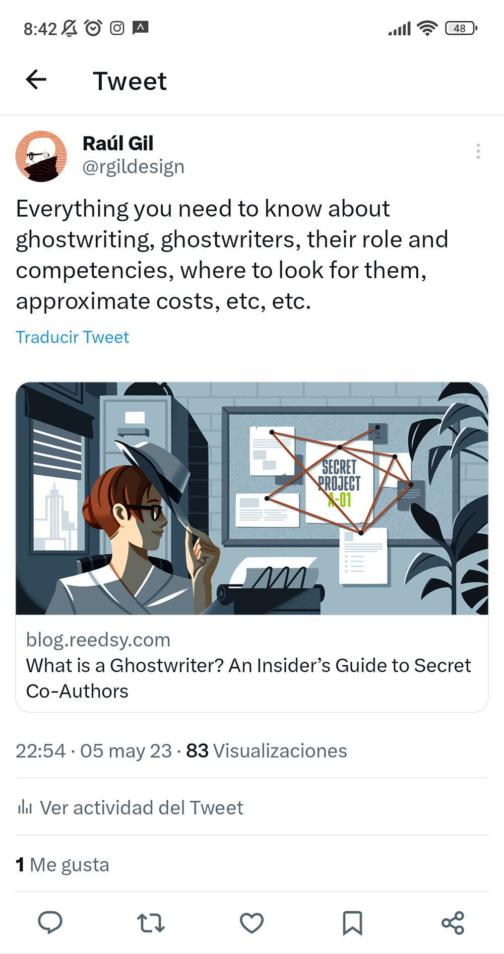

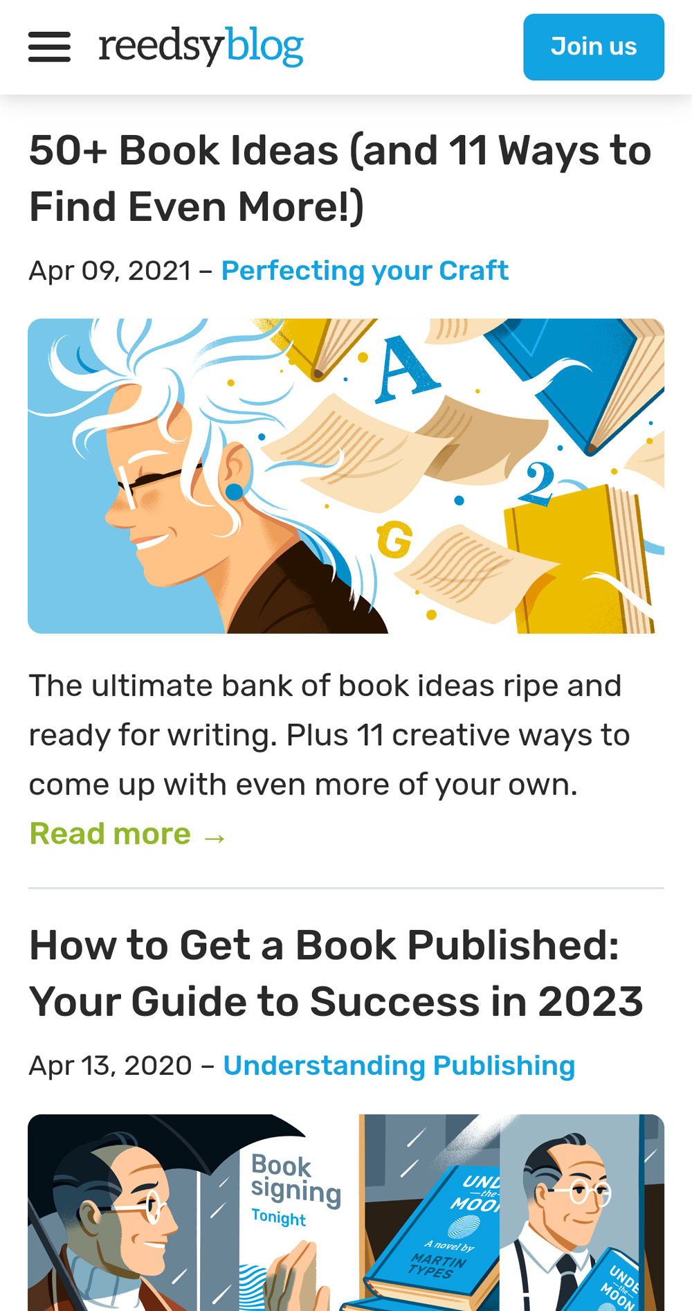
Illustrations working on mobile environments
Compression applied on different platforms, including Reedsy's CMS, destroys the nuances and texture of complex images, so the finish of most Reedsy illustrations is designed to minimize the impact of this fact. Thick strokes and large shapes of flat colour define the base composition, sometimes containing details subject to them. Most images present a key element, situation or action, surrounded by simplified or non-existent environments.
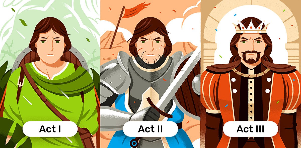

Detailed main elements on simplified environments (or viceversa)


Big shapes and readable silhouettes on flat backgrounds
Despite this, we do not renounce expressive illustrations. Excessive synthesis can lead to a certain depersonalization, which, although favours the system, limits the scope of what we want to tell, often very varied depending on the context. So we don't run away from funny characters, some punctual crazy concepts or a playful approach.




Colour
One of the formal challenges was getting Reedy's predominant colour palette to be present in the illustrations, without limiting our colour options. This is easier in design systems where illustration is extremely compact, simple, or highly abstract.
The fundamental solution consisted of presenting, whenever possible, important elements that make direct use of at least one of Reedsy's base colours (blue, green, yellow, slate...), counting on more diverse complementary palettes that enrich the whole while maintaining the level of brightness and saturation of the company's general image.



Reedsy's blue, green and yellow prevail, with some aid of slates, sands + other complementary colours

Function, not just aesthetics
But Reedsy's illustrations serve a functional purpose. The intention is that the artistic component accompanies the function and not the other way around. The writing community, regardless of their level of experience, is Reedsy's fundamental audience, and most of the content and resources created in the company are at its service.


Example of the many illustrative/educational in-post graphics by Reedsy
On a more technical level, some of the images respond to specific objectives in terms of SEO and share space with thousands of other images, so the challenge is to compete in an extremely saturated context, in which the average user will be exposed to hundreds of stimuli. Attention in favour of our images can make the difference between having a conversion opportunity or not.


Safe zones and distinctive approaches for text-based images competing in SERP
Visual design, illustration and copywriting
Of course, all illustration work is linked to the company's general communication. That means creating a framework in which the illustrated content goes hand in hand with the company's visual design and, of course, copywriting.


Visual assets applied to relevant modals on the blog, hire pages, etc.
Visual solutions
One of my roles has been to create resources or visual solutions that can be reused or adapted to optimize production. Sometimes they are strictly templates that can be edited and repurposed by the team, and in others, they are simply reusable schemes or approximations that respond to the needs of the context:


Genre-based model
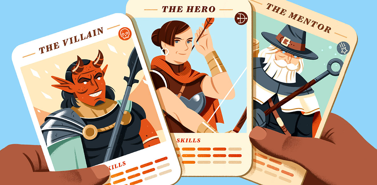

Hands and cards model
Individualized treatment for specific projects
Some projects require specific treatments that are coherent in their context. This may imply a greater or lesser level of abstraction, color palettes adapted to the interface that surrounds them, or particular functional needs.


Example of a much more minimal palette based on Discovery's general UI, for a specific article


Team portraits sample using a slightly more realistic approach. See more here.
Product, publications and derived materials
Working on quality internal products is a great challenge, but also an opportunity to experiment: illustrations to accompany the company's visual design, book covers and/or interiors for literary magazines created around the Reedsy Prompts community, internal documents, free downloadable resources for the community, merchandising items, advertisements and animated pieces... among other projects.
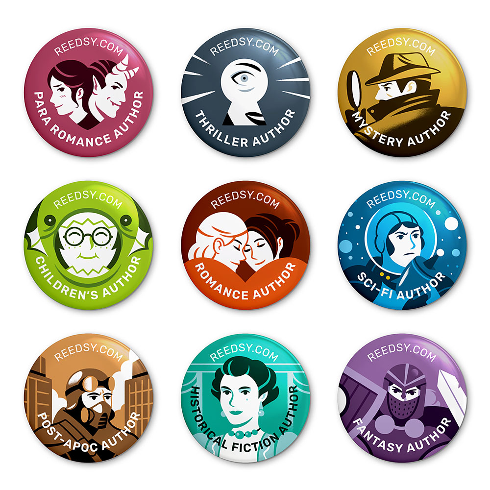
Reedsy's popular Genre Badges

Sample of one of Reedsy's many downloadable resources
Over the course of two and a half years, we have created hundreds of specific images, assets and illustrations, some extremely simple, contingent on the strategic importance of their context, and others created with time and care. Judging when it is relevant to spend time creating new illustrations (instead of repurposing them) has become one more skill to work on over time.


Key frames for animated videos

Prompted Volume 02

Prompted Volume 03
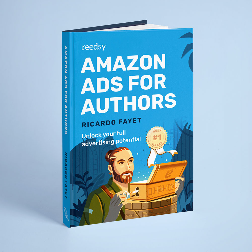
Ricardo Fayet's (Reedsy co-founder) second book

Rocket Bride (editorial resource)
Final thoughts
One of the keys to this (ongoing) project has been not trying to establish an excessively rigid and unbreakable system. We have sacrificed absolute constraint-based coherence in favour of exploring possibilities.
And above all, it has been cooked over low heat, with care, a luxury almost impossible to find in the market today and which responds to the conscious decision of Reedsy's founders to make quality prevail over quantity and to provide their company with character in a global context in which homogeneity, standardization and depersonalization abound.
More info
Reedsy: www.reedsy.com
Reedsy's Dribbble profile: www.dribbble.com/reedsy
Other selected projects


WORK INQUIRIES
WORK INQUIRIES
WORK INQUIRIES
WORK INQUIRIES
WORK INQUIRIES
The imagination is not a state: it is the human existence itself — William Blake
The imagination is not a state: it is the human existence itself — William Blake
The imagination is not a state: it is the human existence itself — William Blake
The imagination is not a state: it is the human existence itself — William Blake